Seven days, one letter, one engineered deviation. The full story of the D Mark: the brief, the science, the geometry, the colour system, and the restraint that holds it together.
Most logos ask to be recognised. I wanted one built to be remembered. So I gave it what I give client work: a real brief, a real process, and a full week of evenings. This is the complete story of the D Mark, from the first sketch to the 16-pixel favicon, including the perceptual science underneath it and the colour system around it.
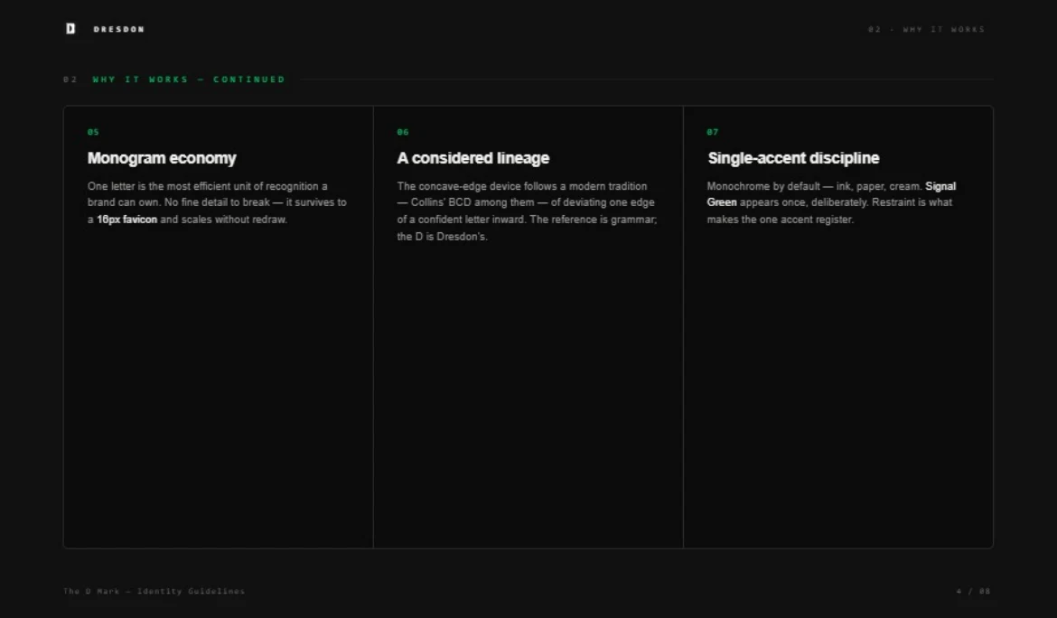
The first two evenings produced no drawings at all. They produced a brief, because a personal mark without constraints turns into decoration. Mine had three lines. It had to be one letter, because one letter is the most efficient unit of recognition a brand can own: no fine detail to break, nothing to redraw at small sizes, nothing to negotiate with a print vendor. It had to survive at 16 pixels, because a personal brand spends most of its life as a favicon in a crowded browser tab, fighting for a recruiter's attention. And it had to be mine, not a font's. A typed letter in a nice typeface is a purchase. A drawn letter is a position.
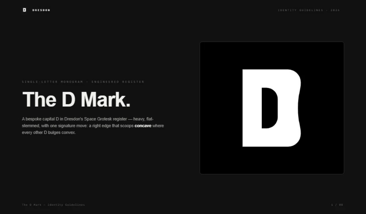
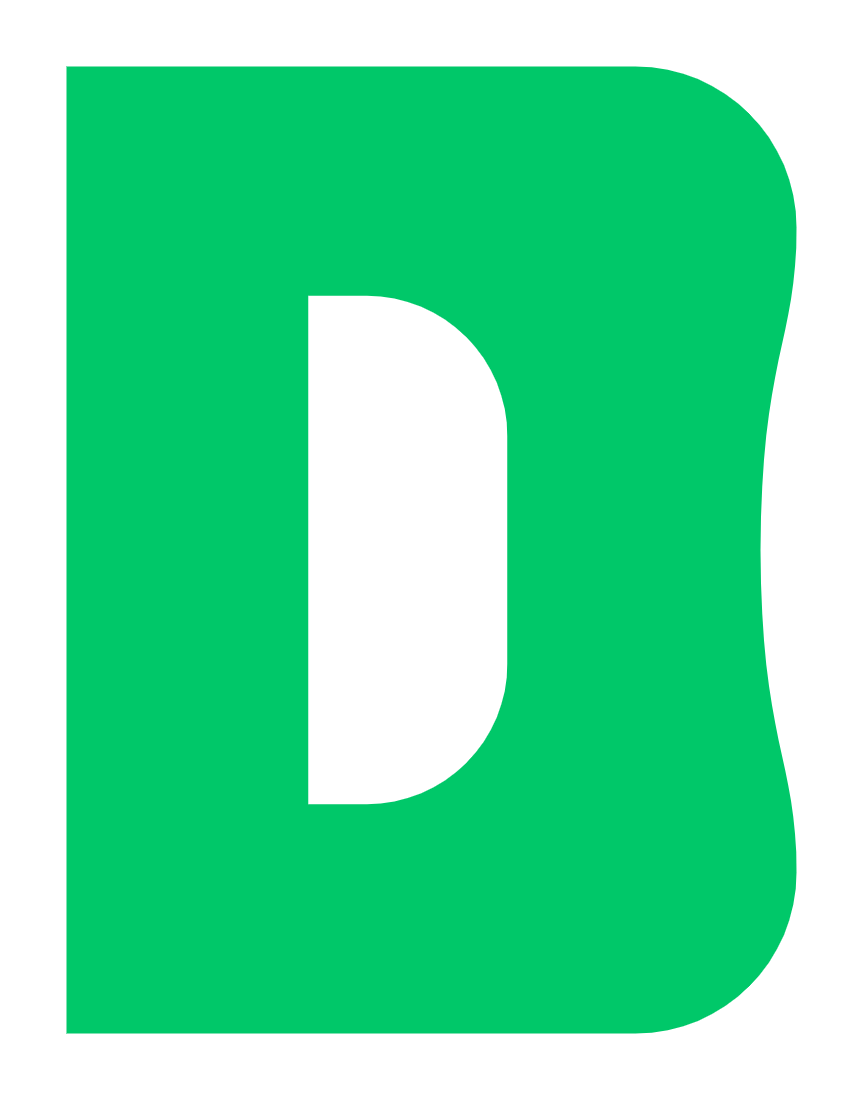
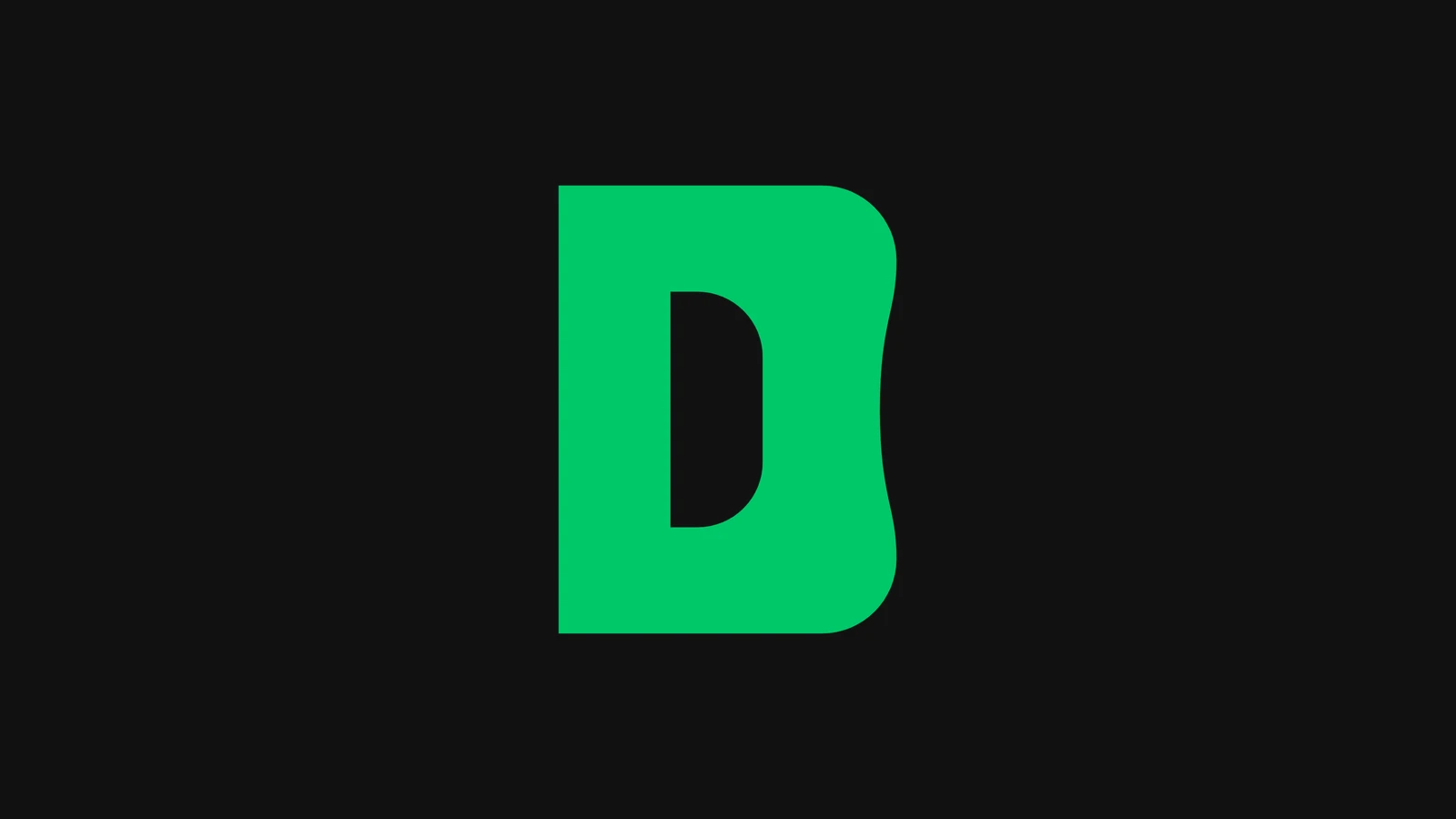
Day three was the day the mark happened. I had pages of respectable capital Ds in my brand's Space Grotesk register: heavy weight, flat vertical stem, clean geometric counter. All of them were fine. None of them were memorable, and fine was exactly the problem. The breakthrough came from asking the opposite question: what does every other D in the world agree on? They agree the bowl bulges outward. So mine would not. The right edge flares to full width at the two corners and scoops inward at the waist, a concave curve exactly where fifty thousand hours of reading has taught your eye to expect convex. One letter. One deviation. A D you cannot un-see.
I am a marketer before I am a designer, so I refuse to ship creative I cannot defend with a mechanism. The concave edge leans on four of them.
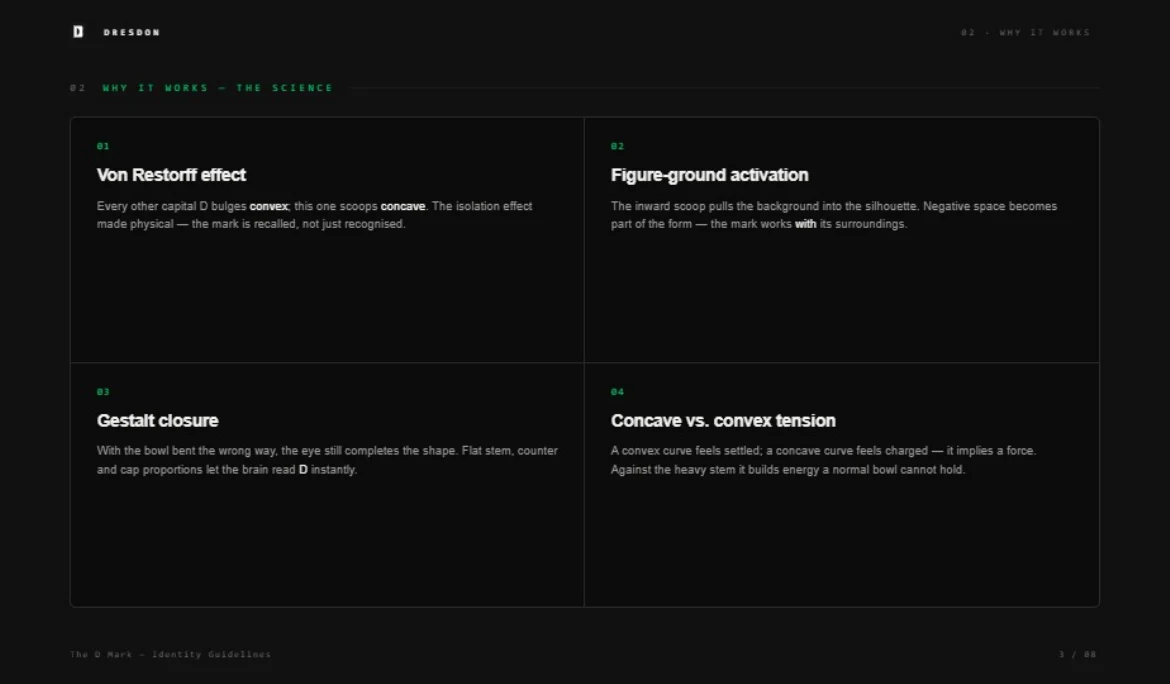
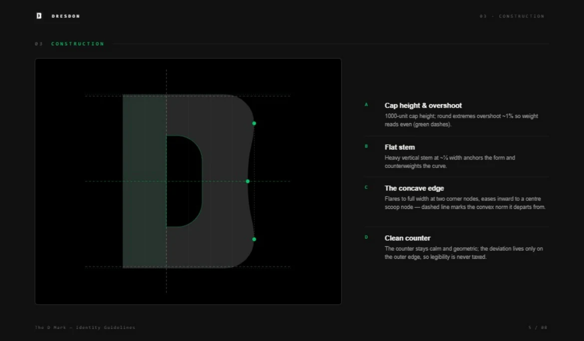
A deviation only earns trust if everything around it is disciplined, so the middle of the week went to construction. The letter sits on a 1,000-unit cap height with roughly one percent overshoot on the round extremes, the same optical correction type designers have used for a century, so the weight reads even instead of mathematically equal. The flat vertical stem holds about a third of the total width, anchoring the form and counterweighting the curve. The concave edge is built from three nodes: two corner flares that reach full width, easing into a centre scoop that departs from the convex norm by a measured amount, enough to register, never enough to break the letterform. The counter stays calm and geometric. The deviation lives only on the outer edge, so legibility is never taxed.
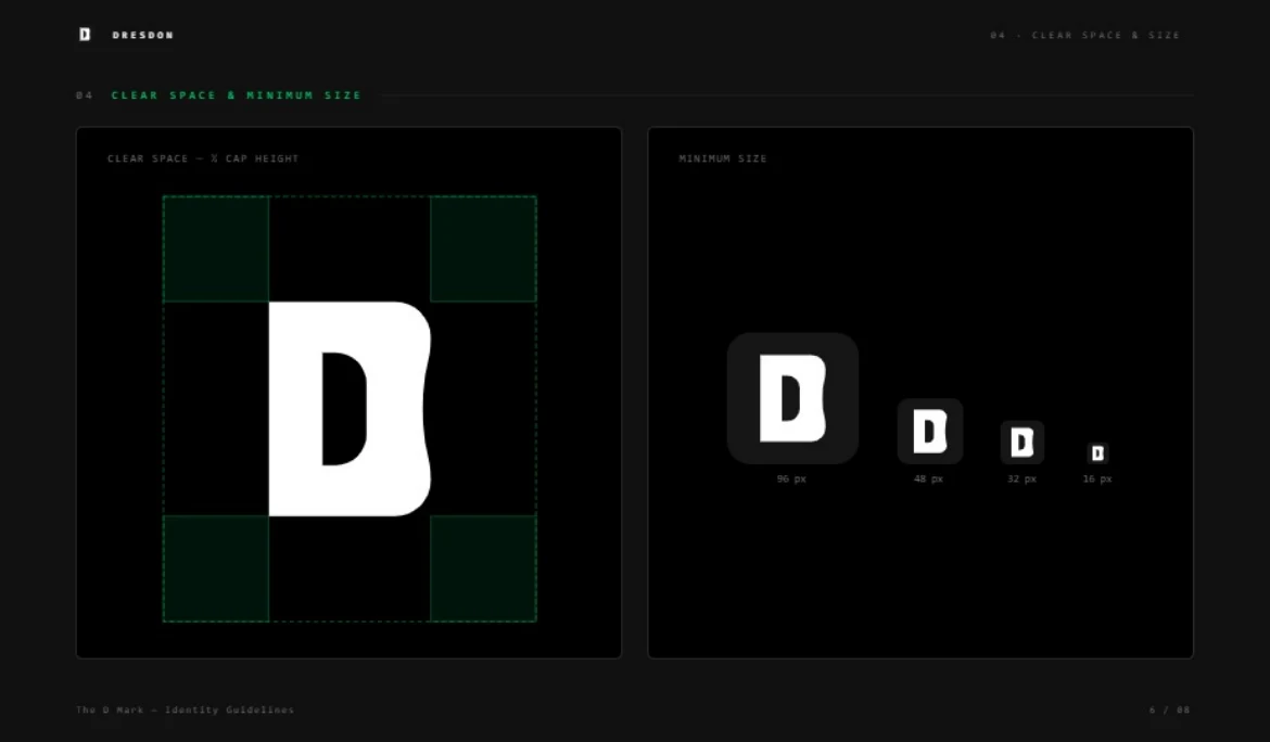
Then I tried to break it. The clear-space rule is half a cap height on every side, which keeps the silhouette readable next to nav links, footer text, and other people's logos. The harder test was size. The mark gets rendered at 96, 48, 32, and finally 16 pixels, the size of a browser favicon, which was the whole point of the brief. The scoop survives. Even when the curve is two pixels of information, the letter reads as something deliberately not-standard, which is all a favicon needs to do.
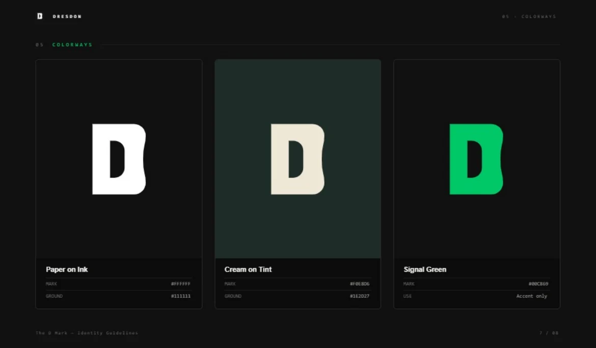
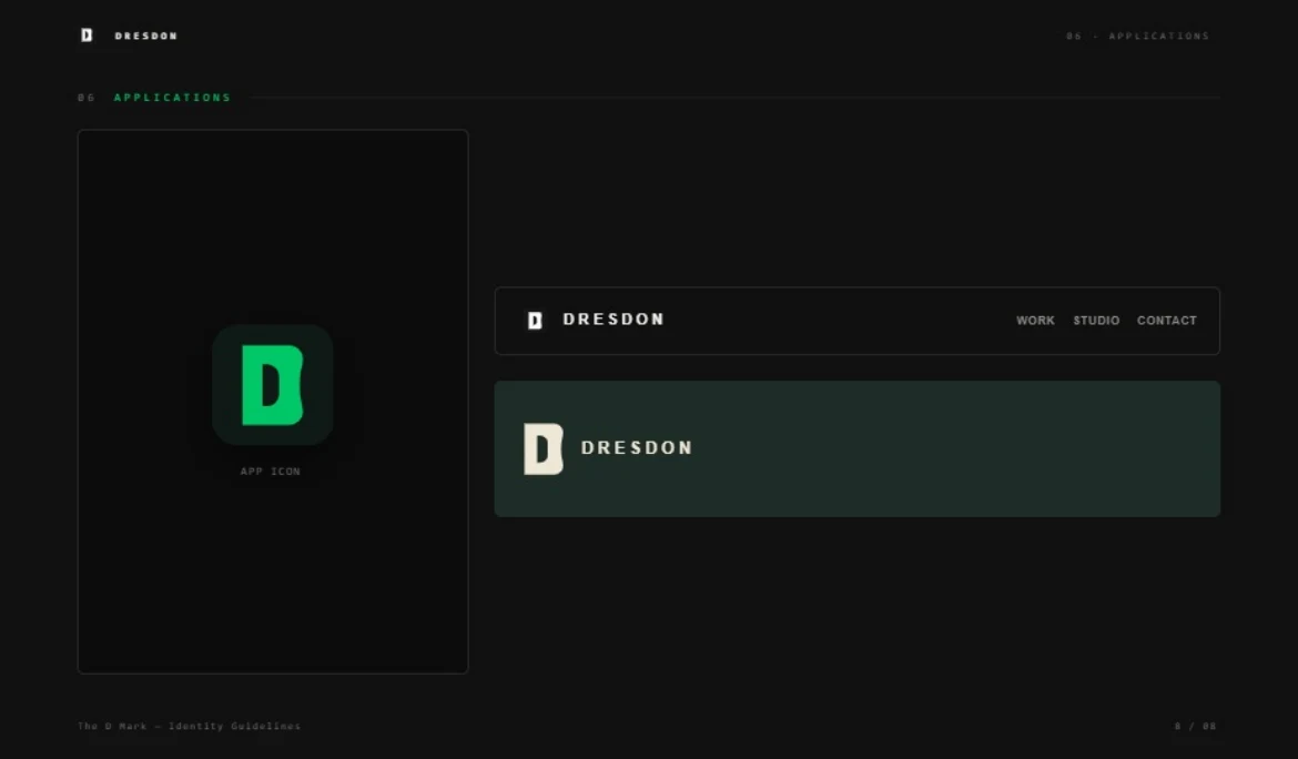
The colour system took one evening because the rule wrote itself: monochrome by default, one accent, used once. Paper on Ink is the workhorse, pure white on near-black. Cream on Tint is the warm variant, a soft cream mark on a deep green-tinted ground for surfaces that need less contrast. And then there is Signal Green, #00C869, which is allowed to appear exactly once on any surface. Never as a flood, never as a background wash. Restraint is what makes a single accent register: when everything is loud, nothing is, and when one thing is green, you look at it. It is the same argument I make about marketing channels, applied to a palette.
The last evening was application testing, because a mark is only finished when it survives contact with real surfaces. The app icon tile. The site navbar lockup next to the wordmark. The cream-on-tint banner treatment. Each one is just the system expressing itself: same geometry, same clear space, same one-accent discipline. If you are reading this on dresdondarrow.com, the mark in the corner of your browser tab is the 16-pixel exam, passing in real time.
The concave-edge device follows a modern tradition of deviating one edge of a confident letterform inward, and Brian Collins' BCD roundel sits in that lineage. I studied those marks the way a writer studies sentences. The reference is grammar, a shared rule about how a deviation earns attention. The D is mine.
A week is a long time to spend on one letter. It is also the entire argument of this site compressed into a single glyph: most work asks to be recognised, and the work that wins is engineered, tested, and restrained until it cannot help being remembered.